The Babylon GUI
How To Use Babylon GUI
The Babylon.js GUI library is an extension you can use to generate interactive user interface. It is build on top of the DynamicTexture.
The latest version can be found on our CDN at https://cdn.babylonjs.com/gui/babylon.gui.js .
And the source code is available on the main Babylon.js repo: https://github.com/BabylonJS/Babylon.js/tree/master/packages/dev/gui.
You can find a complete demo here: https://www.babylonjs.com/demos/gui/
Please note, in addition to the Babylon 2D GUI system described below, with Babylon.js v3.3 and higher, you also have a 3D GUI system available to leverage as well. Both systems can be used for different needs for your project.
Introduction
Babylon.GUI uses a DynamicTexture to generate a fully functional user interface which is flexible and GPU accelerated.
AdvancedDynamicTexture
To begin with Babylon.GUI, you first need an AdvancedDynamicTexture object.
Babylon.GUI has two modes:
Fullscreen mode
In this mode, Babylon.GUI will cover the entire screen and will rescale to always adapt to your rendering resolution. It will also intercept clicks (including touches). To create an AdvancedDynamicTexture in fullscreen mode, just run this code:
var advancedTexture = BABYLON.GUI.AdvancedDynamicTexture.CreateFullscreenUI("myUI");
Here is an example of a simple fullscreen mode GUI: Fullscreen GUI Example
By default the ratio between rendering resolution and texture size is 1. But you can force it to different values with advancedTexture.renderScale. This could be useful if you want crisper texts for instance.
Foreground & background: The fullscreen mode can be rendered in either the foreground or the background of a scene. It can be set like this:
// true == foreground (default)// false == backgroundvar advancedTexture = BABYLON.GUI.AdvancedDynamicTexture.CreateFullscreenUI("myUI", foreground? : Boolean );// it can also be changed on the go:advancedTexture.isForeground = false;
Please note that only one fullscreen mode GUI is allowed per scene
The fullscreen mode is not intended to be used with WebVR as it is a pure 2d rendering. For WebVR scenario you will have to use the texture mode below.
Texture mode
In this mode, BABYLON.GUI will be used as a texture for a given mesh. You will have to define the resolution of your texture. To create an AdvancedDynamicTexture in texture mode, just run this code:
var advancedTexture2 = BABYLON.GUI.AdvancedDynamicTexture.CreateForMesh(myPlane,1024,1024);
Here is an example of a simple texture mode GUI: Texture Mode GUI Example
Here is the same example but now using “billboardMode = all” where the GUI will always face the camera: Texture Mode With Camera Facing GUI Example
Please note that handling pointer move events could be costly on complex meshes, so you can turn off supporting pointer move events with a fourth parameter:
var advancedTexture2 = BABYLON.GUI.AdvancedDynamicTexture.CreateForMesh(myPlane,1024,1024,false);
Once you have an AdvancedDynamicTexture object, you can start adding controls.
Loading from Snippet Server
Here is an example of loading an AdvancedDynamicTexture from the Snippet Server: Loading GUI from Snippet Server
Debugging
Starting with Babylon.js v4.0, the new inspector can help debugging your GUI by displaying bounding infos and letting you dynamically change properties: Inspector Docs
General properties
Events
Please note that controls need to have control.isPointerBlocker = true to correctly handle all the pointer events. This property is set by default on obvious controls like buttons for instance but if you want to have it on controls like images you must turn it on.
All controls have the following observables:
| Observables | Comments |
|---|---|
Observables onPointerMoveObservable | Comments Raised when the cursor moves over the control. Only available on fullscreen mode |
Observables onPointerEnterObservable | Comments Raised when the cursor enters the control. Only available on fullscreen mode |
Observables onPointerOutObservable | Comments Raised when the cursor leaves the control. Only available on fullscreen mode |
Observables onPointerDownObservable | Comments Raised when pointer is down on the control. |
Observables onPointerUpObservable | Comments Raised when pointer is up on the control. |
Observables onPointerClickObservable | Comments Raised when a control is clicked on. |
Observables onClipboardObservable | Comments Raised when a clipboard event is triggered. |
To use the clipboard events, they first need to be enabled by calling registerClipboardEvents on the AdvancedDynamicTexture Instance which will register the cut, copy, paste events onto the canvas. Once enabled, they can be triggered via ctrl/cmd + c for copy, ctrl/cmd + v for paste and ctrl/cmd + x for cut and will always be listening to the canvas. If you have any other action having the same key bindings, you can prevent default triggering of these events by calling unRegisterClipboardEvents which will unregister them from the canvas.
Here is an example on how to use clipboard observables:
- To create new meshes: Clipboard Observable Mesh Creation Example
- To create new textblocks from clipboard data: Clipboard Observable Textblock Example
You can also define that a control is invisible to events (so you can click through it for instance). To do so, just call control.isHitTestVisible.
Please note that onPointerMoveObservable, onPointerDownObservable, onPointerUpObservable, onPointerClickObservable will receive a Vector2 parameter containing the pointer coordinates. If you want to get the pointer coordinates in local control space, you have to call control.getLocalCoordinates(coordinates).
Here is an example of how to use observables: Observables Example Here is an example of how to use the onPointerClickObservable: onPointerClickObservable Example
Alignments
You can define the alignments used by your control with the following properties:
| Property | Default | Comments |
|---|---|---|
Property horizontalAlignment | Default 2 | Comments Can be set to left, right or center. |
Property verticalAlignment | Default 2 | Comments Can be set to top, bottom and center. |
Values can be taken from BABYLON.GUI.Control.HORIZONTAL_ALIGNMENT_* and BABYLON.GUI.Control.VERTICAL_ALIGNMENT_*.
Here is an example of how to use alignments: Alignments Example
Position and size
You can set controls' position with the following properties:
| Property | Type | Default | Default unit |
|---|---|---|---|
Property left | Type valueAndUnit | Default 0 | Default unit Pixel |
Property top | Type valueAndUnit | Default 0 | Default unit Pixel |
Size can be set with:
| Property | Type | Default | Default unit |
|---|---|---|---|
Property width | Type valueAndUnit | Default 100% | Default unit Percentage |
Property height | Type valueAndUnit | Default 100% | Default unit Percentage |
Paddings can be set with:
| Property | Type | Default | Default unit |
|---|---|---|---|
Property paddingTop | Type valueAndUnit | Default 0px | Default unit Pixel |
Property paddingBottom | Type valueAndUnit | Default 0px | Default unit Pixel |
Property paddingLeft | Type valueAndUnit | Default 0px | Default unit Pixel |
Property paddingRight | Type valueAndUnit | Default 0px | Default unit Pixel |
The padding is the space around the control (on the outside) between it and its parent or sibling controls (like CSS margin when box-sizing is set to border-box). This means that the usableWidth = width - paddingLeft - paddingRight. Same for usableHeight = height - paddingTop - paddingBottom.
All these properties can be defined using pixel or percentage as unit.
To set value as pixel, use this construct: control.left = "50px"
To set value as percentage, use this construct: control.left = "50%"
You can also not define the unit (In this case the default unit will be used): control.width = 0.5 (which is equivalent to control.width = "50%")
Here is an example of how to use positions and sizes: Positions and Sizes Example
Tracking positions
All controls can be moved to track position of a mesh.
To do this, just call control.linkWithMesh(mesh). You can then offset the position with control.linkOffsetX and control.linkOffsetY.
Here is an example of a trackable label: Trackable Label Example
Please note that controls that want to track position of a mesh must be at root level (at AdvancedDynamicTexture level).
You can also move a control to a specific coordinates in your scene with control.moveToVector3(position). Please note that the control will not stick with the vector if you change it afterwards.
For Line control, you can also attach the second point to a control with line.connectedControl = control. In this case the x2 and y2 properties are used to offset the second point from the connected control.
With these 2 options, you can create a complete trackable label: Complete Trackable Label Example
Tracking positions features only work when the AdvancedDynamicTexture is in fullscreen mode
Adaptive scaling
When in fullscreen UI, you can decide to define your UI with a fixed resolution.
To define this resolution, just set myAdvancedDynamicTexture.idealWidth = 600 or myAdvancedDynamicTexture.idealHeight = 400.
If both are set, the idealWidth will be used.
If neither is set, you will be responsible for resizing the UI controls yourself.
When ideal resolution is set, all values expressed in pixels are considered relatively to this resolution and scaled accordingly to match the current resolution.
Even when ideal size is set, the fullscreen UI will be rendered at the same resolution of your canvas, but you can decide (mostly for performance reason) to force the texture to use the ideal size for resolution as well. To do so, just call myAdvancedDynamicTexture.renderAtIdealSize = true.
In order to use both idealWidth and idealHeight, set both of them, and set myAdvancedDynamicTexture.useSmallestIdeal = true.
When window width is smaller than window height - idealWidth will be used, otherwise - idealHeight will be used.
This is a good solution for when your canvas can be resized to varying width : height ratios.
Here is an example of how to use horizontal adaptive scaling: Horizontal Adaptive Scaling Example
Rotation and Scaling
Controls can be transformed with the following properties:
| Property | Type | Default | Comments |
|---|---|---|---|
Property rotation | Type number | Default 0 | Comments Value is in radians |
Property scaleX | Type number | Default 1 | Comments |
Property scaleY | Type number | Default 1 | Comments |
Property transformCenterX | Type number | Default 0.5 | Comments Define the center of transformation on X axis. Value is between 0 and 1 |
Property transformCenterY | Type number | Default 0.5 | Comments Define the center of transformation on Y axis. Value is between 0 and 1 |
Please be aware that transformations are done at rendering level so after all computations. This means that alignment or positioning will be done first without taking transform in account.
Here is an example of how to use rotation and scaling: Rotation and Scaling Example
Optimization
For complex controls (like the ColorPicker for instance), you can turn on rendering cache by using control.useBitmapCache = true. This will store a cached version of the control image in order to reuse it when the GUI is updated.
Starting with Babylon.js v4.0 the GUI system uses the Invalidate Rect optimization which allows the renderer to only update portions of the texture. If you want to turn it off, you can call adtTexture.useInvalidateRectOptimization = false
Controls
A control is an abstraction of a piece of UI. There are two kinds of controls:
- Pure controls: A pure control defines an action or an information useful for the user. It could be a TextBlock or a Button.
- Containers: Containers are used to organize your UI. They can contain other controls or containers.
All controls share the following properties:
Controls can be added directly to the AdvancedDynamicTexture or to a container with:
container.addControl(control);
They can be removed with:
container.removeControl(control);
You can also control the control visibility with control.isVisible = false. When isVisible is true, all children will also be invisible. If you just want to hide the current control but keep its children visible then you can use control.notRenderable = true.
TextBlock
The TextBlock is a simple control used to display text: Simple TextBlock Example
Here are the properties you can define:
| Property | Type | Comments |
|---|---|---|
Property lineSpacing (0px) | Type valueAndUnit | Comments Can be set to configure vertical spacing between text lines |
Property text (null) | Type string | Comments Text to display |
Property textWrapping (false) | Type boolean | Comments Can be set to true to enable text wrapping. |
Property resizeToFit (false) | Type boolean | Comments Can be set to true to enable resize to fit. |
Property textHorizontalAlignment (2) | Type number | Comments Can be set to left, right or center |
Property textVerticalAlignment (2) | Type number | Comments Can be set to top, bottom or center |
Property outlineWidth (0) | Type number | Comments Text outline size, in pixels. |
Property outlineColor ("white") | Type string | Comments Text outline color. |
Property wordSplittingFunction | Type string | Comments Function to use to split the text into words |
The control currently provides 1 observable:
| Observables | Comments |
|---|---|
Observables onTextChangedObservable | Comments Raised when the text has changed |
Please note that to get crisp texts you have to ensure that your rendering resolution is aligned with the screen: Crisp Text Resolution Example
On this example you can see on line #3 that we force the engine to get the same DPI as the screen. Then on lines #10 and #11 we scale the GUI to align with the screen resolution.
When in wrapping mode, the text is split into words before being displayed, and words are supposed to be separated by at least one space character. In some languages, however, breaking a text into words should follow some other rules.
For those languages, you can use the wordSplittingFunction property to provide your own splitting function: this function takes a string as input and must return an array of strings (the input string broken into words).
Here's an example for japanese: https://jsfiddle.net/3ph9m0cx/
Line spacing
You can configure vertical line spacing between lines in pixels or percentage values.
lineSpacing should be used with textWrapping set to true.
You can try it here: Simple Line Spacing Example
Resize to Fit
When resizeToFit is set to true, the width and height of the rendered text will be automatically measured and applied to the TextBlock.
This property allows you to change the text and font of a TextBlock without having to worry about manually setting the estimated rendered width and height.
Warning When resizeToFit and textWrapping are both set to true the width of the block will not be resized to fit the text, however the height will be. This means that, depending on the font size, parts of the text on each line may be missing and the width of the block may need to be changed manually.
InputText
The InputText is a control used to let users insert text in a single line: InputText Example
Here are the properties you can define:
| Property (default) | Type | Comments |
|---|---|---|
Property (default) text (null) | Type string | Comments Text to display |
Property (default) color (white) | Type string | Comments Foreground color |
Property (default) background (black) | Type string | Comments Background color |
Property (default) focusedBackground (black) | Type string | Comments Background color to use when the control is focused |
Property (default) autoStretchWidth (true) | Type boolean | Comments The control will resize horizontally to adapt to text size |
Property (default) maxWidth (100%) | Type valueAndUnit | Comments The maximum width allowed if autoStretchWidth is set to true |
Property (default) margin (10px) | Type valueAndUnit | Comments Margin to use on left and right inside the control itself. This margin is used to determine where the text will be drawn |
Property (default) thickness (1) | Type number | Comments Thickness of the border |
Property (default) highligherOpacity (0.4) | Type number | Comments Defines the transparency of highlighted text's background |
Property (default) textHighlightColor (#D5E0FF) | Type string | Comments Background color of highlighted text |
Property (default) onFocusSelectAll (false) | Type boolean | Comments Allows complete selection of text by default when the input is focused. |
The InputText is a focusable control. This means you can click / touch it in order to give it the focus and control over the keyboard events. You can remove the focus from the control by hitting enter or clicking outside of the control.
The control provides several observables to track its state:
| Observables | Comments |
|---|---|
Observables onTextChangedObservable | Comments Raised when the text has changed |
Observables onBeforeKeyAddObservable | Comments Raised just before the entered key is added to the text |
Observables onFocusObservable | Comments Raised when the control gets the focus |
Observables onBlurObservable | Comments Raised when the control loses the focus |
Observables onTextHighlightObservable | Comments Raised when the text is highlighted |
Observables onTextCopyObservable | Comments Raised when the copy event is triggered |
Observables onTextCutObservable | Comments Raised when the cut event is triggered |
Observables onTextPasteObservable | Comments Raised when the paste event is triggered |
Observables onKeyboardEventProcessedObservable | Comments Raised when a key event was processed |
Please note that the InputText has pretty limited edition support. Here are the supported keys:
- Delete
- Backspace
- Home
- End
- Enter
- Left / Right (used to move the cursor)
Furthermore, please note that due to JavaScript platform limitation, the InputText cannot invoke the onscreen keyboard. On mobile, the InputText will use the prompt() command to get user input. You can define the title of the prompt by setting control.promptMessage.
Using onBeforeKeyAddObservable for extended keyboard layouts and input masks
The onBeforeKeyAddObservable observable can be used to extend or change how the InputText control accepts text. For example, it's possible to implement support for different keyboard layouts using this feature where some keys act as modifiers for the next entered key or you can implement an input mask which only accepts numerical keys.
The observable is triggered just before a printable key will be added to the text in the control. The attached handler can then use the following methods to get information on the keyboard state and to modify how the key is handled within the control:
| Method | Description |
|---|---|
Method currentKey | Description The key that will be appended to the text |
Method addKey | Description If true, the key in currentKey will be added to the text, otherwise it will be skipped |
Method deadKey | Description Set to true if the user hit the dead key on the keyboard. Handler must reset to false |
For example, if the handler wants to limit the control to only accept numerical keys, then it can set addKey to false if the value of currentKey is not numerical. The key will then not be added to the text. Similarly dead key support can be implemented by checking the deadKey flag and setting currentKey to the appropriate character for the dead key + key combination.
Please note that the observable is only triggered by printable keys, that is, keys that can be added to the text, and not by control keys like backspace and enter.
Here's an example showing two inputs, one which only accepts numerical keys and one which has simple dead key support: Restricted Input Example
InputText also supports clipboardObservables, here's an example: InputText With ClipboardObservable
InputPassword
The InputPassword is a control that shows the entered characters as bullets and is thus suited for entering passwords: InputPassword Example
Otherwise it behaves the same as the InputText control and has the same properties as shown above.
There are no configuration options available that are specific to this control. For example, it is not possible to show the entered plain text.
Button
A button can be used to interact with your user. Please see the events chapter to see how to connect your events with your buttons. The onPointerClickObservable is raised when a button is clicked, meaning both the down and up event happen while the cursor is over the control.
There are three kinds of buttons available out of the box:
- ImageButton: An image button is a button made with an image and a text. You can create one with:
var button = BABYLON.GUI.Button.CreateImageButton("but","Click Me","textures/grass.png");
You can try it here: Button Example
- ImageWithCenterTextButton: An image button made with a image background and a centered text overlay.
var button = BABYLON.GUI.Button.CreateImageWithCenterTextButton("but","Click Me","textures/grass.png");
You can try it here: ImageWithCenterTextButton Example
- SimpleButton: A simple button with text only
var button = BABYLON.GUI.Button.CreateSimpleButton("but", "Click Me");
You can try it here: SimpleButton Example
- ImageOnlyButton:
var button = BABYLON.GUI.Button.CreateImageOnlyButton("but","textures/grass.png");
You can try it here: ImageOnlyButton Example
Please also note that by default buttons will handle hit testing based on their bounding info. If you want to have embedded controls to handle the picking you can call button.delegatePickingToChildren = true
Accessing parts
You can use the following properties to get button's parts (if available):
- image: Returns the image part of the button (if any)
- textBlock: Returns text related properties of the button
Visual animations
By default a button will change its opacity on pointerOver and will change it scale when clicked. You can define your own animations with the following callbacks:
- pointerEnterAnimation
- pointerOutAnimation
- pointerDownAnimation
- pointerUpAnimation
Custom button
You can also create a complete custom button by manually adding children to the button. Here is how the ImageButton is built:
BABYLON.GUI.Button.CreateMyCustomButton = function(name, text, imageUrl) {var result = new BABYLON.GUI.Button(name);// Adding textvar textBlock = new BABYLON.GUI.TextBlock(name + "_button", text);textBlock.textWrapping = true;textBlock.textHorizontalAlignment =BABYLON.GUI.Control.HORIZONTAL_ALIGNMENT_CENTER;textBlock.paddingLeft = "20%";result.addControl(textBlock);// Adding imagevar iconImage = new BABYLON.GUI.Image(name + "_icon", imageUrl);iconImage.width = "20%";iconImage.stretch = BABYLON.GUI.Image.STRETCH_UNIFORM;iconImage.horizontalAlignment = BABYLON.GUI.Control.HORIZONTAL_ALIGNMENT_LEFT;result.addControl(iconImage);return result;};
Checkbox
The checkbox is used to control a boolean value.
You can specify the value with checkbox.isChecked.
Changing the isChecked property will raise an observable called checkbox.onIsCheckedChangedObservable.
The control is rendered using the following properties:
| Property | Type | Default | Comments |
|---|---|---|---|
Property color | Type string | Default white | Comments Foreground color |
Property background | Type string | Default black | Comments Background color |
Property checkSizeRatio | Type number | Default 0.8 | Comments Define the ratio used to compute the size of the inner checkbox (0.8 by default, which means the inner check size is equal to 80% of the control itself) |
Here is an example of a checkbox: Checkbox Example
RadioButton
The radio button is used to define a value among a list by using a group of radio buttons where only one can be true.
You can specify the selected value with radiobutton.isChecked.
Changing the isChecked property will raise an observable called checkbox.onIsCheckedChangedObservable. Furthermore, if you select a radio button, all other radio buttons within the same group will turn to false.
The control is rendered using the following properties:
| Property | Type | Default | Comments |
|---|---|---|---|
Property color | Type string | Default white | Comments Foreground color |
Property background | Type string | Default black | Comments Background color |
Property checkSizeRatio | Type number | Default 0.8 | Comments Define the ratio used to compute the size of the inner checkbox (0.8 by default, which means the inner check size is equal to 80% of the control itself) |
Property group | Type string | Default empty string | Comments Use the group property to gather radio buttons working on the same value set |
Here is an example of a radiobutton: RadioButton Example
Slider
The slider is used to control a value within a range.
You can specify the range with slider.minimum and slider.maximum.
The value itself is specified with slider.value and will raise an observable everytime it is changed (slider.onValueChangedObservable).
The control is rendered using the following properties:
| Property | Type | Default | Comments |
|---|---|---|---|
Property borderColor | Type string | Default white | Comments Color used to render the border of the thumb |
Property color | Type string | Default white | Comments Foreground color |
Property background | Type string | Default black | Comments Background color |
Property barOffset | Type valueAndUnit | Default 5px | Comments Offset used vertically to draw the background bar |
Property thumbWidth | Type valueAndUnit | Default 30px | Comments Width of the thumb |
Property displayThumb | Type boolean | Default true | Comments Indicates if the thumb must be rendered (useful to simulate progress bar) |
Property isThumbCircle | Type boolean | Default false | Comments Indicates if the thumb should be a circle (square if false) |
Property isThumbClamped | Type boolean | Default false | Comments Indicates if the thumb should be clamped |
Property isVertical | Type boolean | Default false | Comments Indicates that the slider will be rendered vertically instead of horizontally |
Property step | Type number | Default 0 | Comments Indicates the degree of precision required for sldier values (0 means full precision where 0.01 means 2 digits precision) |
When using vertical slider, you have to make sure that height is bigger than width. The opposite has to be true when using isVertical = false.
Here is an example of a slider: Slider Example
ImageBasedSlider
You can use an ImageBasedSlider to customize a slider using pictures. This control can be configured like the Slider)
It is rendered using the following properties:
| Property | Type | Default | Comments |
|---|---|---|---|
Property backgroundImage | Type string | Default null | Comments Path to the image to use for the background |
Property valueBarImage | Type string | Default null | Comments Path to the image to use for the value bar |
Property thumbImage | Type string | Default null | Comments Path to the image to use for the thumb |
Property barOffset | Type valueAndUnit | Default 5px | Comments Offset used vertically to draw the background bar |
Property thumbWidth | Type valueAndUnit | Default 30px | Comments Width of the thumb |
Property displayThumb | Type boolean | Default true | Comments Indicates if the thumb must be rendered (useful to simulate progress bar) |
Property isThumbClamped | Type boolean | Default false | Comments Indicates if the thumb should be clamped |
Property isVertical | Type boolean | Default false | Comments Indicates that the slider will be rendered vertically instead of horizontally |
Here is an example of a sliders and image based sliders: ImageBasedSlider Example
Line
The line will draw a line (!!) between two points.
Here are the properties you can define:
| Property | Type | Default | Comments |
|---|---|---|---|
Property x1 | Type number | Default 0 | Comments X coordinate of the first point |
Property y1 | Type number | Default 0 | Comments Y coordinate of the first point |
Property x2 | Type number | Default 0 | Comments X coordinate of the second point |
Property y2 | Type number | Default 0 | Comments Y coordinate of the second point |
Property dash | Type array of numbers | Default Empty array | Comments Defines the size of the dashes |
Property lineWidth | Type number | Default 1 | Comments Width in pixel |
Here is an example of a line: Line Example
MultiLine
MultiLine will draw lines between any number of meshes, controls and points.
Each item in MultiLine is called MultiLinePoint, and has the following properties:
| Property | Type | Default | Comments |
|---|---|---|---|
Property mesh | Type AbstractMesh | Default null | Comments Tracks a Mesh |
Property control | Type Control | Default null | Comments Tracks a Control |
Property x | Type number | Default null | Comments x of a point, can be specified in px or % |
Property y | Type number | Default null | Comments y of a point, can be specified in px or % |
Here are the functions you can use:
- add(): Receives any number of arguments and adds them, each argument can be a mesh, a control, or a point. Returns an array of MultiLinePoint
- push(): Receives 1 argument and adds it, each argument can be a mesh, a control, or a point. Returns a MultiLinePoint
- remove(): Recives an index or an instance of a MultiLinePoint and removes it
- getAt(): Recives an index of a MultiLinePoint and returns its instance. If no MultiLinePoint exists in that index - a new one is created
Here are the properties you can define in MultiLine:
| Property | Type | Default | Comments |
|---|---|---|---|
Property dash | Type array of numbers | Default Empty array | Comments Defines the size of the dashes |
Property lineWidth | Type number | Default 1 | Comments Width in pixel |
Here is an example of a MultiLine combining meshes, a control and a point: MultiLine Example
Image
Use the image control to display an image in your UI.
You can control the stretch used by the image with image.stretch property. You can set it to one of these values:
- BABYLON.GUI.Image.STRETCH_NONE: Use original size
- BABYLON.GUI.Image.STRETCH_FILL: Scale the image to fill the container (This is the default value)
- BABYLON.GUI.Image.STRETCH_UNIFORM: Scale the image to fill the container but maintain aspect ratio
- BABYLON.GUI.Image.STRETCH_EXTEND: Scale the container to adapt to the image size.
- BABYLON.GUI.Image.STRETCH_NINE_PATCH: Scale the image using a nine patch technique. You have to either define the
sliceLeft,sliceRight,sliceTopandsliceBottomproperties or store data into your image (in the first and last rows and columns) and callimage.populateNinePatchSlicesFromImage = trueto read that data. Demo: Stretch_Nine_Patch Example
You may want to have the Image control adapt its size to the source image. To do so just call image.autoScale = true.
You can change image source at any time with image.source="myimage.jpg".
You can also define which part of the source image you want to use with the following properties:
- sourceLeft: x coordinate in the source image (in pixel)
- sourceTop: y coordinate in the source image (in pixel)
- sourceWidth: width of the source image you want to use (in pixel)
- sourceHeight: height of the source image you want to use (in pixel)
Here is an example of an image: Image Example
You can use animation sheet in the image using properties image.cellId, image.cellWidth, image.cellHeight. Image With Sprite Sheet Example
You can also apply stretch to animation sheet using image.stretch property.
Starting with babylon.js v4.0, you can also set img.detectPointerOnOpaqueOnly = true to indicate if pointers should only be validated on pixels with alpha > 0.
Batch loading of SVG images from icon sheet
You can now load multiple SVG icons from a single SVG icon sheet without manually defining multiple sourceLeft, sourceTop, sourceWidth, sourceHeight attributes for each image.
Pre-requisite: a valid single layer SVG document with width, height, viewbox defined and icons grouped via ids. The layer should not have any transform attributes.
onSVGAttributesComputedObservable will trigger when the sourceLeft, sourceTop, sourceWidth, sourceHeight attributes are automatically computed. You can create custom SVG buttons that are built from multiple SVG assets (glow, text, images etc) for even cleaner code.
Here is an example that uses SVG assets for images and buttons: SVG Asset GUI Example
Known issue: The batch loading process requires the entire SVG icon sheet to be loaded as a HTMLObjectElement in the DOM. On certain browsers, you may notice a quick flash of the icon sheet on the canvas as the assets load. To alleviate this, you may employ a loading screen.
ColorPicker
The color picker control allows users to set colors in your scene.
Whenever a user interacts with the color picker an observable is triggered (colorPicker.onValueChangedObservable) which returns the current value (Color3) of the color picker.
The control is rendered using the following properties:
| Property | Type | Default | Comments |
|---|---|---|---|
Property size | Type string or number | Default "200px" | Comments The size, width, and height property will always be the same value since the color picker can only be a square. |
Here is an example of a color picker: ColorPicker Example
DisplayGrid
The display grid control is a simple control used to display grids inside your GUI.
The control is rendered using the following properties:
| Property | Type | Default | Comments |
|---|---|---|---|
Property background | Type string | Default "Black" | Comments Defines the color of the grid background |
Property cellWidth | Type number | Default 20 | Comments Defines the width of each cell |
Property cellHeight | Type number | Default 20 | Comments Defines the height of each cell |
Property minorLineTickness | Type number | Default 1 | Comments Defines the tickness of minor lines |
Property minorLineColor | Type string | Default "DarkGray" | Comments Defines the color of the minor lines |
Property majorLineTickness | Type number | Default 2 | Comments Defines the tickness of major lines |
Property majorLineColor | Type string | Default "White" | Comments Defines the color of the major lines |
Property majorLineFrequency | Type number | Default 5 | Comments Defines the frequency of major lines |
Here is an example of a display grid: DisplayGrid Example
VirtualKeyboard
The VirtualKeyboard is a control used to display simple onscreen keyboard. This is mostly useful with WebVR scenarios where the user cannot easily use his keyboard.
Keys
You can define the keys provided by the keyboard with the following code:
var keyboard = new BABYLON.GUI.VirtualKeyboard();keyboard.addKeysRow(["1","2","3","4","5","6","7","8","9","0","\u2190"]);
Every key will be created using default values specified by the following properties:
| Property | Default |
|---|---|
Property defaultButtonWidth | Default 40px |
Property defaultButtonHeight | Default 40px |
Property defaultButtonPaddingLeft | Default 2px |
Property defaultButtonPaddingRight | Default 2px |
Property defaultButtonPaddingTop | Default 2px |
Property defaultButtonPaddingBottom | Default 2px |
Property defaultButtonColor | Default #DDD |
Property defaultButtonBackground | Default #070707 |
You can also override each property by providing an array containing properties for keys (or null):
addKeysRow(["a", "b"], [null, { width: "200px" }]);
You can define each default properties based on the following class:
class KeyPropertySet {width?: string;height?: string;paddingLeft?: string;paddingRight?: string;paddingTop?: string;paddingBottom?: string;color?: string;background?: string;}
Layouts
The VirtualKeyboard provides a static method to create a default layout:
var keyboard = BABYLON.GUI.VirtualKeyboard.CreateDefaultLayout();
The default layout is equivalent to:
addKeysRow(["1", "2", "3", "4", "5", "6", "7", "8", "9", "0", "\u2190"]);addKeysRow(["q", "w", "e", "r", "t", "y", "u", "i", "o", "p"]);addKeysRow(["a", "s", "d", "f", "g", "h", "j", "k", "l", ";", "'", "\u21B5"]);addKeysRow(["\u21E7", "z", "x", "c", "v", "b", "n", "m", ",", ".", "/"]);addKeysRow([" "], [{ width: "200px" }]);
VirtualKeyboard Events
Every time a key is pressed the onKeyPressObservable observable is triggered. But you can also rely on keyboard.connect(inputText) to automatically connect a VirtualKeyboard to an InputText. In this case, the keyboard will only appear when the InputText will be focused and all key pressed events will be sent to the InputText.
You can find a complete demo here: VirtualKeyboard Events Example
Containers
The containers are controls used to host other controls. Use them to organize your UI.
Containers has one specific property: container.background. Use it to define the background color of your container.
By default containers do not block pointer events (ie. the underlying scene will receive the pointer event even if the pointer is over a container). You can prevent this behavior by calling container.isPointerBlocker = true.
Containers are responsible for managing their children's layout. To prevent layout cycles, the system will not let the layout being updated during a cycle more than 3 times. This value can be changed with container.maxLayoutCycle. You can also turn on console warnings when layout cycles are detected with container.logLayoutCycleErrors = true.
Adaptative size
You can decide to have your containers to adapt their size to their children by using one of these properties:
- adaptWidthToChildren (false by default)
- adaptHeightToChildren (false by default)
If you set one of these properties to true, the associated dimension (width, height or both) will be computed based on direct children size as long as it is defined in pixel (size cannot be defined in percentage because this will generate an infinite loop as the child will need the parent size and the parent will need the child size) You can find a demo here: Adaptative size Example
Make your controls non-overlapping
If you link your control with a mesh, the control will follow the mesh and the position of the control will be automatically changed relative to the position of the linked mesh. Sometimes your controls will be overlapped by each other.
To solve this problem you can use the moveToNonOverlappedPosition method of the AdvancedDynamicTexture class.
First you need to set a value for the overlapGroup property on your control. If you leave it undefined the control will be not touched during the execution of the moveToNoveOverlappedPosition method. Second you need to call the moveToNonOverlappedPosition method of the AdvancedDynamicTexture class manually each frame, for example in the render loop or using an observer. The onBeginRenderObservable of the AdvancedDynamicTexture is a good place.
Please refer to this playground with detailed comments in the code on how to use this functionality: Non-overlapping controls Example
Forum: https://forum.babylonjs.com/t/non-overlapping-gui-linked-controls/24610
Clipping
By default containers will clip their children to their bounds. You can disable this option by calling this code:
container.clipChildren = false;
Please note that not clipping children may generate issues with adt.useInvalidateRectOptimization so it is recommended to turn this optimization off if you want to use unclipped children.
You can find a demo here: Clipping Example
Rectangle
The Rectangle is a rectangular container with the following properties:
| Property | Type | Default | Comments |
|---|---|---|---|
Property thickness | Type number | Default 1 | Comments Thickness of the border |
Property cornerRadius | Type number | Default 0 | Comments Size in pixel of each corner. Used to create rounded rectangles |
Here is an example of a rectangle control: Rectangle Example
Ellipse
The Ellipse is a ellipsoidal container with the following properties:
| Property | Type | Default | Comments |
|---|---|---|---|
Property thickness | Type number | Default 1 | Comments Thickness of the border |
Here is an example of an ellipse control: Ellipse Example
StackPanel
The StackPanel is a control which stacks its children based on its orientation (can be horizontal or vertical).
All children must have a defined width or height (depending on the orientation) in pixels (A warning will be written to the console if this is not true. This warning can be turned off with panel.ignoreLayoutWarnings = true).
The height (or width) of the StackPanel is defined automatically based on children.
| Property | Type | Default | Comments |
|---|---|---|---|
Property isVertical | Type boolean | Default true | Comments Orientation of the panel |
Here is an example of a StackPanel: StackPanel Example
ScrollViewer
Due to its rich feature set, the ScrollViewer has its own dedicated page right here.
Grid
The Grid is a control which defines a set of rows and columns and allows children to specify which cell they want to belong to:
var grid = new BABYLON.GUI.Grid();grid.addColumnDefinition(100, true);grid.addColumnDefinition(0.5);grid.addColumnDefinition(0.5);grid.addColumnDefinition(100, true);grid.addRowDefinition(0.5);grid.addRowDefinition(0.5);// This rect will be on first row and second columnvar rect = new BABYLON.GUI.Rectangle();rect.background = "green";rect.thickness = 0;grid.addControl(rect, 0, 1);// This rect will be on second row and third columnrect = new BABYLON.GUI.Rectangle();rect.background = "red";rect.thickness = 0;grid.addControl(rect, 1, 2);
You can define rows and columns with the following functions:
- addColumnDefinition(width, isPixel): Use this function to create a new column. Width can be between 0 and 1 if isPixel is false (percentage mode then) or contains an actual width if isPixel is true
- addRowDefinition(height, isPixel): Use this function to create a new row. Height can be between 0 and 1 if isPixel is false (percentage mode then) or contains an actual width if isPixel is true
Here is an example of a grid made of 4 columns where the first and the last will have a width of 50px and the second and third will each have 50% of the remaining space:
grid.addColumnDefinition(100, true);grid.addColumnDefinition(0.5);grid.addColumnDefinition(0.5);grid.addColumnDefinition(100, true);
You can update or delete columns and rows with the following functions:
- setRowDefinition(index, height, isPixel): Update a row definition
- setColumnDefinition(index, width, isPixel): Update a column definition
- removeRowDefinition(index): Remove a row definition at specified index
- removeColumnDefinition(index): Remove a column definition at specified index
Two properties can also help you getting rows and columns count:
- rowCount: Will give you the number of rows
- columnCount: Will give you the number of columns
To add a control in a grid, you have to specify the row and column indexes:
grid.addControl(control, 1, 2); // 2nd row, thrid column
You can get the list of controls in a specific cell by calling:
var controls = grid.getChildrenAt(2, 3);
Here is an example of a Grid: Grid Example
Styles
Starting with Babylon.js v3.3, you can create a style object that will be used to share configuration across controls. To do so, you can use this code:
var style = advancedTexture.createStyle();style.fontSize = 24;style.fontStyle = "italic";style.fontFamily = "Verdana";
Then affect the style to a control:
textControl.style = style;
Here is the lsit of properties supported by styles so far:
- fontSize
- fontStyle
- fontFamily
- fontWeight
Please note that if a control has a style, then the style values are used instead of values directly defined on the control itself.
You can find a demo here: Styles Example
Helpers
To reduce the amount of code required to achieve frequent tasks you can use the following helpers:
-
BABYLON.GUI.Control.AddHeader(control, text, size, options { isHorizontal, controlFirst }): This function will create a StackPanel (horizontal or vertical based on options) and will add your control plus a TextBlock in it. Options can also be used to specify if the control is inserted first of after the header. Depending on the orientation, size will either specify the widht or the height used for the TextBlock. -
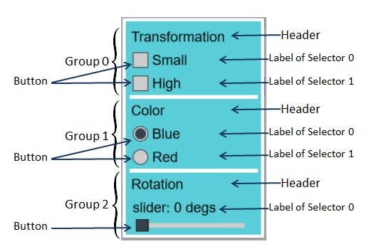
BABYLON.GUI.Checkbox.AddCheckBoxWithHeader(title, onValueChanged): This function will create a horizontal StackPanel and will add a checkbox alongside a text block displaying thetitleproperty.onValueChangeddefines the callback to call when checkbox state changes. -
BABYLON.GUI.RadioButton.AddRadioButtonWithHeader(title, group, isChecked, onValueChanged): This function will create a horizontal StackPanel and will add a radio button (set with specified group and isChecked parameters) alongside a text block displaying thetitleproperty.onValueChangeddefines the callback to call when radio button state changes.
GUI and postprocesses
LayerMask
In order to not apply postprocesses to your GUI, you will have to use a multi-cameras approach: one for your main scene and one for your GUI.
You can find an implementation example here: LayerMask Example
The key point is to use the camera.layerMask property to isolate your GUI:
var camera2 = new BABYLON.ArcRotateCamera("Camera",0,0.8,100,BABYLON.Vector3.Zero(),scene);camera2.layerMask = 2;// GUI - simply set advancedTexture layerMask to 2var advancedTexture = BABYLON.GUI.AdvancedDynamicTexture.CreateFullscreenUI("UI");advancedTexture.layer.layerMask = 2;
Then all meshes of your main scene will have a different layerMask attached to main camera:
var camera1 = new BABYLON.ArcRotateCamera("Camera",0,0.8,100,BABYLON.Vector3.Zero(),scene);camera1.layerMask = 1;myMesh.layerMask = 1;
Multi-scenes
The other option will be to use a multi scene approach with a renderloop defined like this:
guiScene.autoClear = false;engine.runRenderLoop(function() {mainScene.render();guiScene.render();});
In this case the guiScene will host your GUI and the mainScene will host your scene with your postprocesses.
GUI and HighDPI Displays
If you are viewing the scene on a high dpi (or "retina") device (such as many mobile devices, or some laptops), you may notice that text on the UI appears "blurry" or "pixelated". This is because, starting in Babylon.js v2.6, the engine no longer defaults to adapting to the device pixel ratio. This was done for performance reasons on mobile devices; turning it on can have a large impact on performance. To improve the rendering of text (at the cost of performance), you will need to enable the adaptToDeviceRatio option when constructing your engine.
Please see Turning AdaptToDeviceRatio Off/On for more information on the trade offs.