Babylon 3D GUI
How To Use Babylon 3D GUI
The Babylon.js 3D GUI library is an extension you can use to generate 3D interactive user interface.
The latest version can be found on our CDN at https://cdn.babylonjs.com/gui/babylon.gui.js .
And the source code is available on the main Babylon.js repo: https://github.com/BabylonJS/Babylon.js/tree/master/packages/dev/gui.
Introduction
Babylon.GUI uses meshes to create an interactive user interface, which is fully integrated in your scene.
GUI3DManager
To begin with 3D GUI, you need to instantiate a GUI3DManager which will be responsible for connecting all the controls together:
var manager = new BABYLON.GUI.GUI3DManager(scene);
The manager only requires the scene to work on. Once instantiated, the manager will create a utility layer which is a specific child scene that will host all the meshes used to render the controls. This way, your main scene won't get populated by the utility meshes.
You can reach the utility layer with manager.utilityLayer.
Once you have a manager, you can start adding controls with manager.addControl(control). All controls will be added to the manager.rootContainer.
Please also note that the following functions are available:
containsControl(): Gets a boolean indicating if the given control is in the root child list.removeControl(): Removes a control from the root child list.
The manager also supports a scaling option, manager.useRealisticScaling, that scales all added controls to a size more comfortable for XR interactions. Alternatively, a custom scaling can be applied to all controls by setting the value of manager.controlScaling. Scaling effects done in these ways can be overridden by updating the control's scale normally. Setting either of these values will apply the change to all existing and future controls the manager owns.
Containers
A container is used to organize controls in the scene. The base class for all containers is the Container3D class. The manager.rootContainer is a Container3D object.
All containers provide the following functions to handle controls:
addControl(): Adds a control to the children of this containercontainsControl(): Gets a boolean indicating if the given control is in the root child listremoveControl(): Removes a control from the root child list
By default, all containers will update their layout everytime you add a new control to it. But you can optimize this behavior if you plan to add multiple controls in a row with container.blockLayout = true:
panel.blockLayout = true;for (var index = 0; index < 30; index++) {var button = new BABYLON.GUI.Button3D("click me");panel.addControl(button);}panel.blockLayout = false;
The Container3D class will do nothing regarding layout of its controls. You need to use one of its children to get a specialized layout mechanism.
All specialized containers must implement the following function to provide layout mechanism:
_arrangeChildren(): This function will be called everytime a new control is added. This is where children class can decide how to organize controls
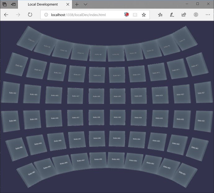
StackPanel
The StackPanel container can be used to stack items either horizontally or vertically:
var panel = new BABYLON.GUI.StackPanel3D();panel.isVertical = true;
The panel will automatically arrange its content every time you add a new control.
You can specify the distance between elements with panel.margin = 0.02.
See it in action here: 3D GUI StackPanel
VolumeBasedPanel
VolumeBasedPanel are containers used to dispatch items on the surface of a volume (like sphere or cylinder).
The panels will automatically arrange its content every time you add a new control.
The panels can either be row or column first depending on which property you use:
panel.columns = 5; // The panel will automatically compute the number of rows based on number of child controls
or
panel.rows = 5; // The panel will automatically compute the number of columns based on number of child controls
By default a VolumeBasedPanel is set up with panel.columns = 10;
You can specify the distance between elements with panel.margin = 0.02.
You can also control how each cell is oriented:
| Value | Type | Description |
|---|---|---|
Value 0 | Type BABYLON.Container3D.UNSET_ORIENTATION | Description Control rotation will remain unchanged |
Value 1 | Type BABYLON.Container3D.FACEORIGIN_ORIENTATION | Description Control will rotate to make it look at sphere central axis |
Value 2 | Type BABYLON.Container3D.FACEORIGINREVERSED_ORIENTATION | Description Control will rotate to make it look back at sphere central axis |
Value 3 | Type BABYLON.Container3D.FACEFORWARD_ORIENTATION | Description Control will rotate to look at z axis (0, 0, 1) |
Value 4 | Type BABYLON.Container3D.FACEFORWARDREVERSED_ORIENTATION | Description Control will rotate to look at negative z axis (0, 0, -1) |
SpherePanel
The SpherePanel container can be used to dispatch items on the surface of a sphere:
var panel = new BABYLON.GUI.SpherePanel();panel.radius = 5;
The radius property is used to define the radius of the hosting sphere.
See it in action here: 3D GUI SpherePanel
CylinderPanel
The CylinderPanel container can be used to dispatch item on the surface of a cylinder:
var panel = new BABYLON.GUI.CylinderPanel();panel.radius = 5;
The radius property is used to define the radius of the hosting cylinder.
See it in action here: 3D GUI CylinderPanel

PlanePanel
The PlanePanel container can be used to dispatch item on the surface of a plane:
var panel = new BABYLON.GUI.PlanePanel();
See it in action here: 3D GUI PlanePanel

ScatterPanel
The ScatterPanel container can be used to dispatch items using a randomized planar mapping:
var panel = new BABYLON.GUI.ScatterPanel();panel.iterations = 100;
The iterations property is used to define the number of iteration to use to scatter the controls (100 by default)

See it in action here: 3D GUI ScatterPanel
Controls
All controls inherit from the Control3D class which provides a set of basic features:
position: Gets or sets the control position in world spacescaling: Gets or sets the control scaling in world spaceparent: Gets or sets the parent containerisVisible: Gets or sets a boolean indicating if the control is visiblenode: Gets the transform node used by this controlmesh: Gets the mesh used to render this control
You can attach a control to a mesh or tranform node from your scene with:
control.linkToTransformNode(anchor);
This way the control will always follow the linked node or mesh. Please note that in this case, the position and scaling properties are considered local to the new parent node or mesh.
When linking a control to a transform node, please make sure that the control was first added to a container or to the root manager.
Some observables are also available to help tracking control state:
onPointerEnterObservable: An event triggered when pointer enters the controlonPointerOutObservable: An event triggered when the pointer move out of the controlonPointerDownObservable: An event triggered when the pointer taps the controlonPointerUpObservable: An event triggered when pointer is uponPointerClickObservable: An event triggered when a control is clicked on (with a mouse)onPointerMoveObservable: An event triggered when the pointer move over the control
All controls can also be the target of behaviors so they expose the associated properties and functions:
behaviors: Gets the list of attached behaviorsaddBehavior(): Attach a behavior to the controlremoveBehavior(): Remove an attached behaviorgetBehaviorByName(): Gets an attached behavior by name
All controls can also define a callback when specific event is happening. These callbacks will be called to let the user defines an animation for the control. Here is the list of available callbakcs:
pointerEnterAnimation: Callback used to start pointer enter animationpointerOutAnimation: Callback used to start pointer out animationpointerDownAnimation: Callback used to start pointer down animationpointerUpAnimation: Callback used to start pointer up animation
All these callbacks are empty by default and will be implemented by specialized controls.
Button3D
Button3D is a class used to create 3D buttons.
A button is a control with default animations for enter/out/down and up events. It is based on a 2D GUI content.
You can specify the content through the content property and set it to any regular 2D GUI content:
var button = new BABYLON.GUI.Button3D("reset");var text = new BABYLON.GUI.TextBlock();text.text = "reset";text.color = "white";text.fontSize = 24;button.content = text;
By default the Button3D control uses a 512x512 AdvancedDynamicTexture to render its content.
You can use the following properties to change the texture resolution:
contentResolution: Gets or sets the texture resolution used to render content (512 by default)contentScaleRatio: Gets or sets the texture scale ratio used to render content (2 by default)
See it in action here: 3D GUI Button3D Control
MeshButton3D
This class is used to to create an interactable object which will use a mesh coming from the current scene to render.
var pushButton = new BABYLON.GUI.MeshButton3D(mesh, "pushButton");
Once created, you can use the new MeshButton3D to add animations:
pushButton.pointerEnterAnimation = () => {mesh.material.albedoColor = hoverColor;};pushButton.pointerOutAnimation = () => {mesh.material.albedoColor = new BABYLON.Color3(0.5, 0.19, 0);};
See it in action here: MeshButton3D Demo
HolographicButton
The HolographicButton is a specialized button that mimics the Mixed Reality Toolkit holographic button.
An HolographicButton can be defined with two properties:
text: Gets or sets text for the buttonimageUrl: Gets or sets the image url for the button

See it in action here: 3D GUI HolographicButton Control
Please note that you can overwrite the default content but you need to do it after the call to addControl:
var button = new BABYLON.GUI.HolographicButton("reset");panel.addControl(button);// Must be done AFTER addControl in order to overwrite the default contentvar text1 = new BABYLON.GUI.TextBlock();text1.text = "Reset";text1.color = "Red";text1.fontSize = 48;button.content = text1;
TouchHolographicButton
The TouchHolographicButton is a newer version HolographicButton that is more suited for Hololens 2 volume interactions.
It has the same use as HolographicButton:
var button = new BABYLON.GUI.TouchHolographicButton("reset");panel.addControl(button);// Must be done AFTER addControl in order to overwrite the default contentvar text1 = new BABYLON.GUI.TextBlock();text1.text = "Reset";text1.color = "Red";text1.fontSize = 48;button.content = text1;
The main functional difference between the TouchHolographicButton and HolographicButton is that the TouchHolographicButton supports near interactions (such as touching the button directly with hand tracking).
HolographicSlate
The HolographicSlate is used to display content. It can be dragged around, rotated and scaled. With 1 pointer you have to use the handles to rotate and scale the slate, with 2 pointers you can pinch and twist the title bar to rotate and scale.
The HolographicSlate hosts an AdvancedDynamicTexture to display content, simply set the content property to a Control or collection of Controls to adjust what is displayed. It also has an adjustable title bar at the top that can display a title by setting the title property.
The dimensions can be manually set at any time, but are also updated when the user adjusts the slate using the handles around the outside of the slate. The dimensions will never go below the minimum dimensions in either direction, but the minimum dimensions can be set separately. If using the slate handles to resize, the aspect ratio will be maintained even when trying to resize smaller than the minimum.
// Create the 3D UI managervar manager = new BABYLON.GUI.GUI3DManager(scene);// Let's add a slatevar slate = new BABYLON.GUI.HolographicSlate("down");slate.title = "Checkers";slate.minDimensions = new BABYLON.Vector(5, 5);slate.dimensions = new BABYLON.Vector2(10, 10);slate.titleBarHeight = 1.5;manager.addControl(slate);// Must be done AFTER addControl in order to overwrite the default contentslate.content = new BABYLON.GUI.Image("checkers", "./textures/Checker_Albedo.png");
Content inside the slate can also be scrolled in X or Y directions. Use the contentResolution property to manipulate the resolution of the texture.
The slate natively provides 2 TouchHolographicButton on the top right, the leftmost enables the FollowBehavior for the slate, and the rightmost destroys the slate.
Near Menu
The NearMenu is a small control that displays buttons close to the user. By default, it follows the user with FollowBehavior. It can be pinned in the world either by using the pin button, or whenever the user drags the backplate.
Below, an exemple of a horizontal 3-button near menu.
// Create the 3D UI managervar manager = new BABYLON.GUI.GUI3DManager(scene);// Let's add a slatevar near = new BABYLON.GUI.NearMenu("near");manager.addControl(near);var button0 = new BABYLON.GUI.TouchHolographicButton("button0");button0.imageUrl = "./textures/IconFollowMe.png";button0.text = "Button 0";near.addButton(button0);var button1 = new BABYLON.GUI.TouchHolographicButton("button1");button1.imageUrl = "./textures/IconClose.png";button1.text = "Button 1";near.addButton(button1);var button2 = new BABYLON.GUI.TouchHolographicButton("button2");button2.imageUrl = "./textures/IconFollowMe.png";button2.text = "Button 2";near.addButton(button2);
As NearMenu is a child class of VolumeBasedPanel, the direction of the layout can be changed by tweaking the parameters rows and columns.
For example, to make a near menu with n buttons vertical, use :
near.rows = n;
Hand Menu
The HandMenu is a NearMenu that uses the HandConstraintBehavior. It is useful for XR experiences to always have a 3D menu in hand range.
By default, the HandMenu positions itself on the outer side of the users left hand, and only activates when the user both has their palm facing them and is looking at (facing) their hand. These defaults can be changed by modifying the properties on the HandConstraintBehavior attached to the HandMenu.
Custom controls
You can create your own custom control by inheriting from the Control3D class and implementing the following functions:
_createNode(): Called on controls to create a transform node or a mesh to represent the control_affectMaterial(): Called on controls to prepare and affect a material if a mesh is used to represent the control